ARKE Fitness
INDUSTRYPrimary health care
SERVICES PROVIDEDBrand Strategy
Communications
Visual Language
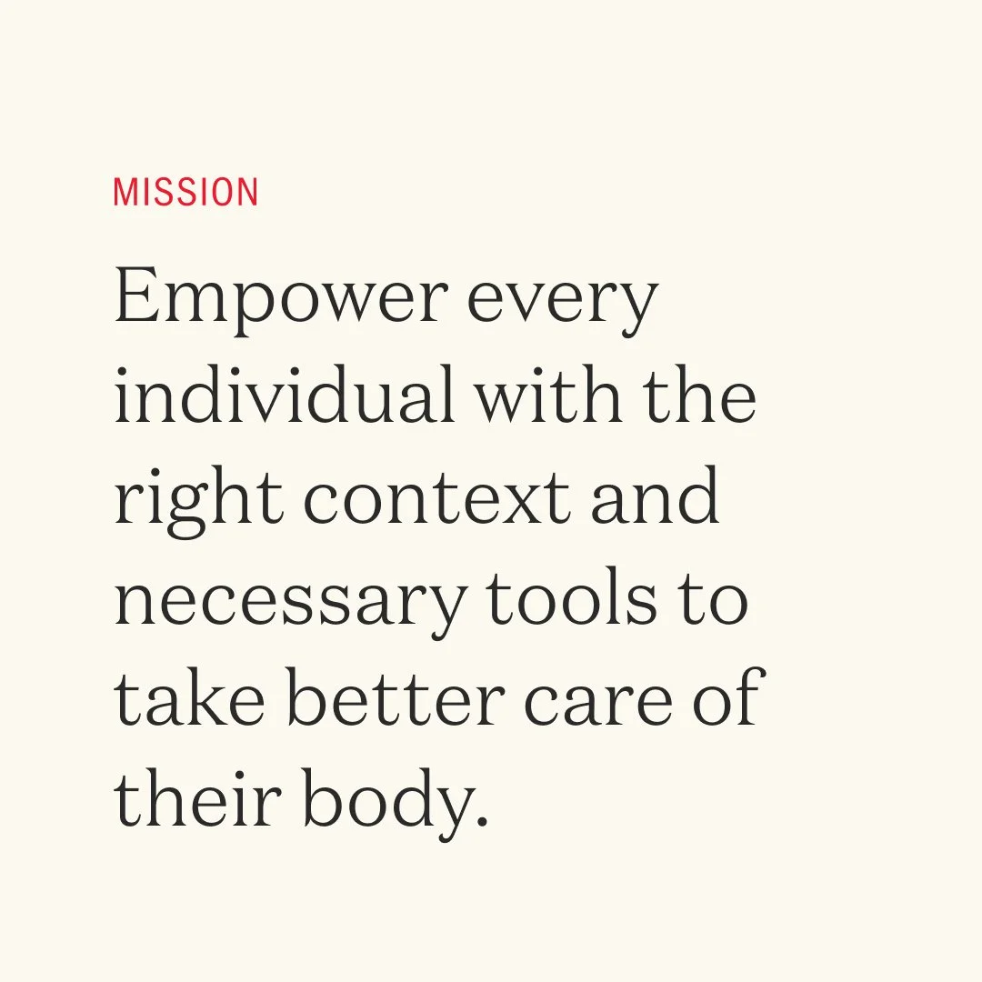
ARKE Fitness is a physiotherapy and personal training space that is redefining a better fitness experience for everyone. As the team works with complexity (rather than against it), they empower people with better context and necessary tools to move forward and to do things better than the time before.
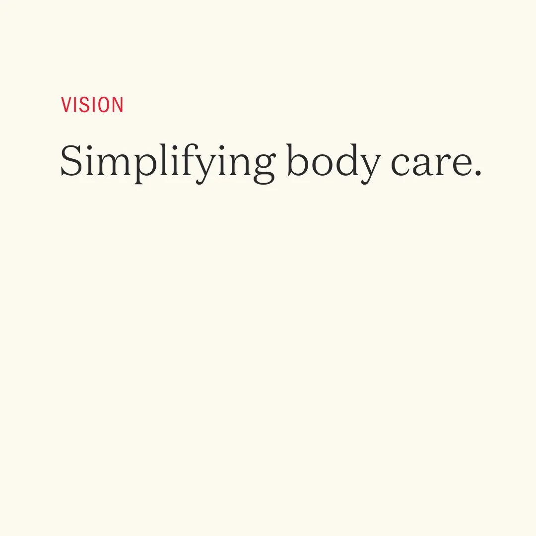
At Arke, they view fitness as an enabler that allows people to take risks – a safety net that exists to support us. Arke's goal is to encourage their clients to take opportunities that present themselves along the way – because that is what makes us grow and what makes life exciting. For them, proper body care is all about empowerment.

BRAND STRATEGY
Arke was for the underdogs, those figuring life out by doing things better than the time before. We aim for the rule-breakers and people who love their freedom: opt in, opt out, switch it, change it, make-it-yours. Embracing life with all of its risks and thereby empowering our customers to live their lives to the fullest – that is the underlying concept of the new brand.
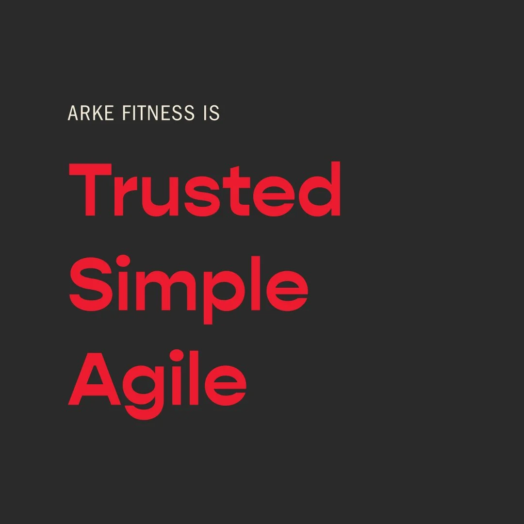
The team at Arke identified its brand attributes as trusted, simple, and agile.
Trusted: Their reputation within its industry and community had already cemented a feeling of trust, and clients need people they can rely on.
Simple: The word 'Simple’ has been an important word since the company's founding because let's face it, fitness can be complex, but Arke creates a simplified, effective system for clients.
Agile: Fitness, especially progress, constantly change and evolve. Hence, Arke is dedicated to staying at the forefront to help people adapt and adjust their process when needed.
COMMUNICATIONS
The Arke voice is assured, experienced, with a spirit of confidence. "With us, this becomes easier." It is a voice that inspires customers to believe that they too, can embody those same qualities. They put heart and honesty into everything they say and do.
Their voice reflects their capability, integrity, and experience – and makes others feel capable in return.
VISUAL LANGUAGE
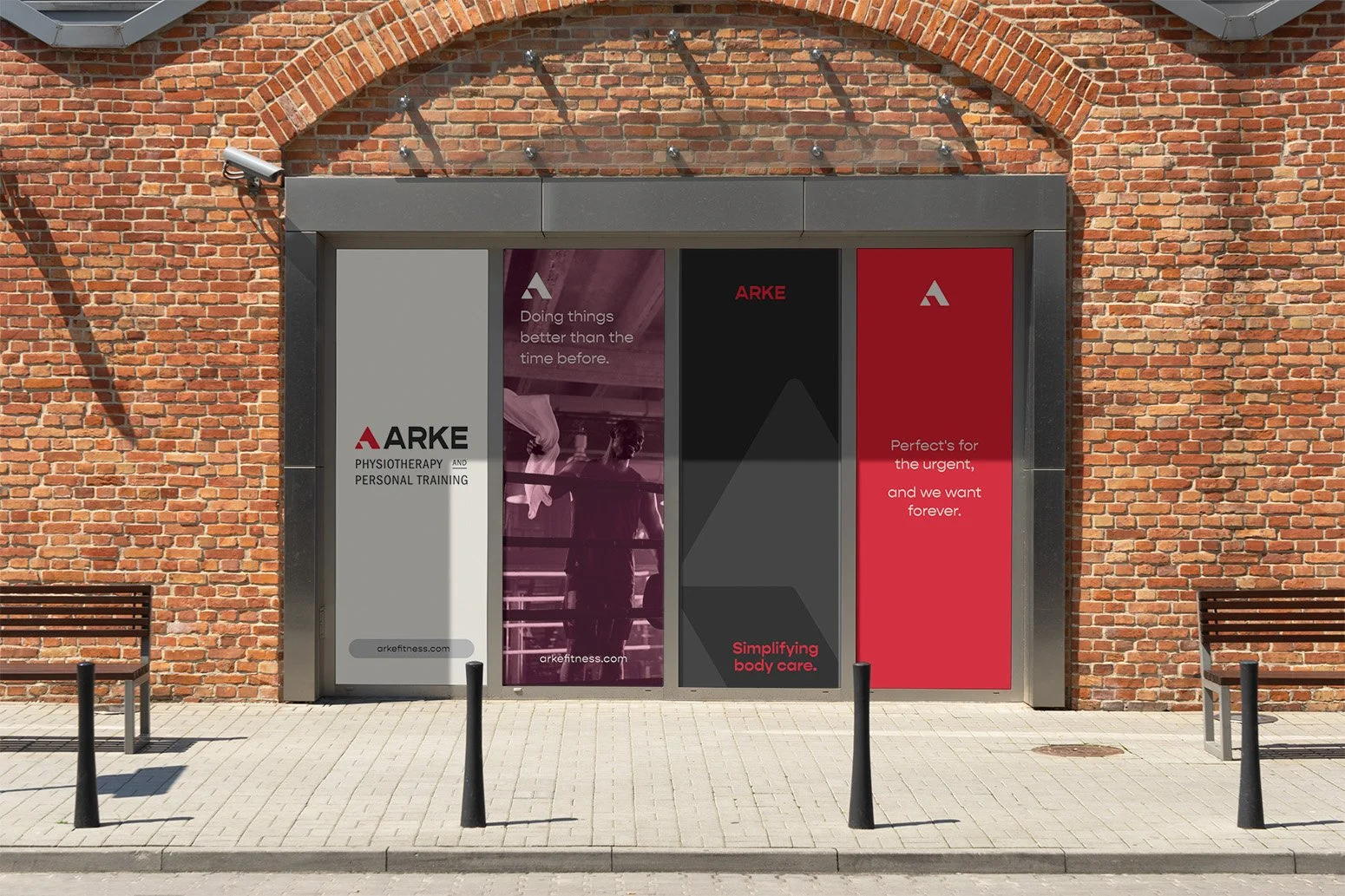
Because Arke works with complexity, rather than against it, we wanted to embrace the Outlaw archetype in brand experiences. This meant using their identity and physical space as a medium for voices of social change, protest, and rally.
In practice, this meant to stand out after learning where we fit in. The whole visual system has polish and personality.
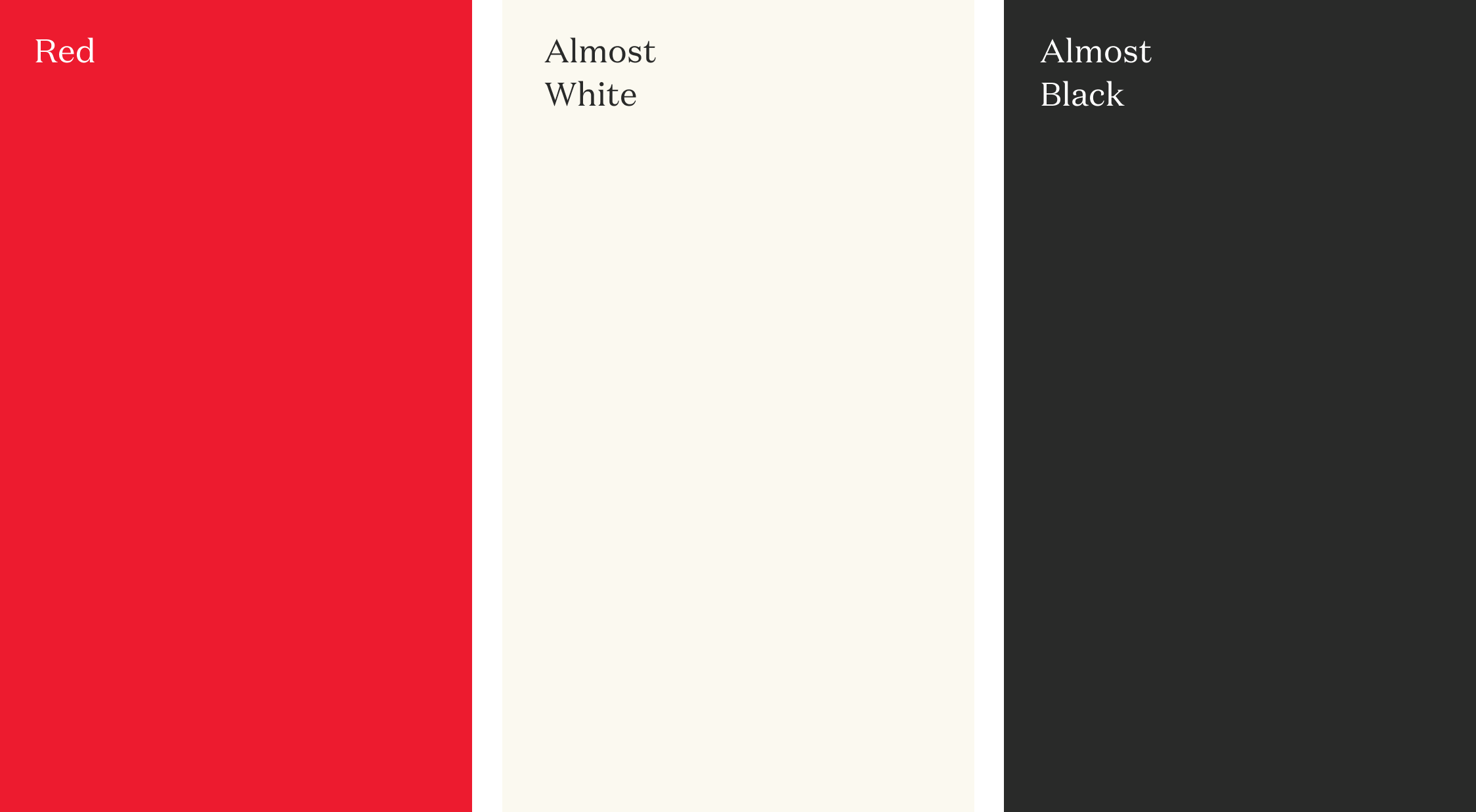
Goodbye, sea of sterile blues and greens. Hello, crimson dynamo red.


Gopher is Arke's lead display typeface. It was chosen for its ability to feel both playful and confident, lending an approachable outlook. Gopher is a reverse contrast, geometric sans serif typeface. A typical contrast has thicker vertical strokes and thinner horizontal, but Gopher provides a unique look by switching that contrast. Stand out, remember?

MESSAGING CONCEPTS
As established in their voice and tone, Arke is always conversational; never condescending. To break through the intricate science-backed language, their messaging needed to pierce through the monotony by being anything but monotonous.