Precise Rehab
PROJECT BRIEF
When it comes to recovery, we are facing a huge contradiction: nobody likes to think about dealing with pain, until the pain is all that is left to think about. Physical therapy tends to have a strange reputation, often being perceived as a necessary evil and reserved only for accident victims, injured athletes, or the elderly. At Precise Rehab, they want to break this paradigm.
Precise Rehab offers a comprehensive solution and approach to get you to move pain-free, to do more every day. By pairing informed patient-care assessments with active rehabilitation, Precise Rehab seamlessly provides personalised treatments for every person that walks through their doors.
INDUSTRYPrimary health care
SERVICESBrand Strategy
Visual Identity
Communications
LOGO REDESIGN
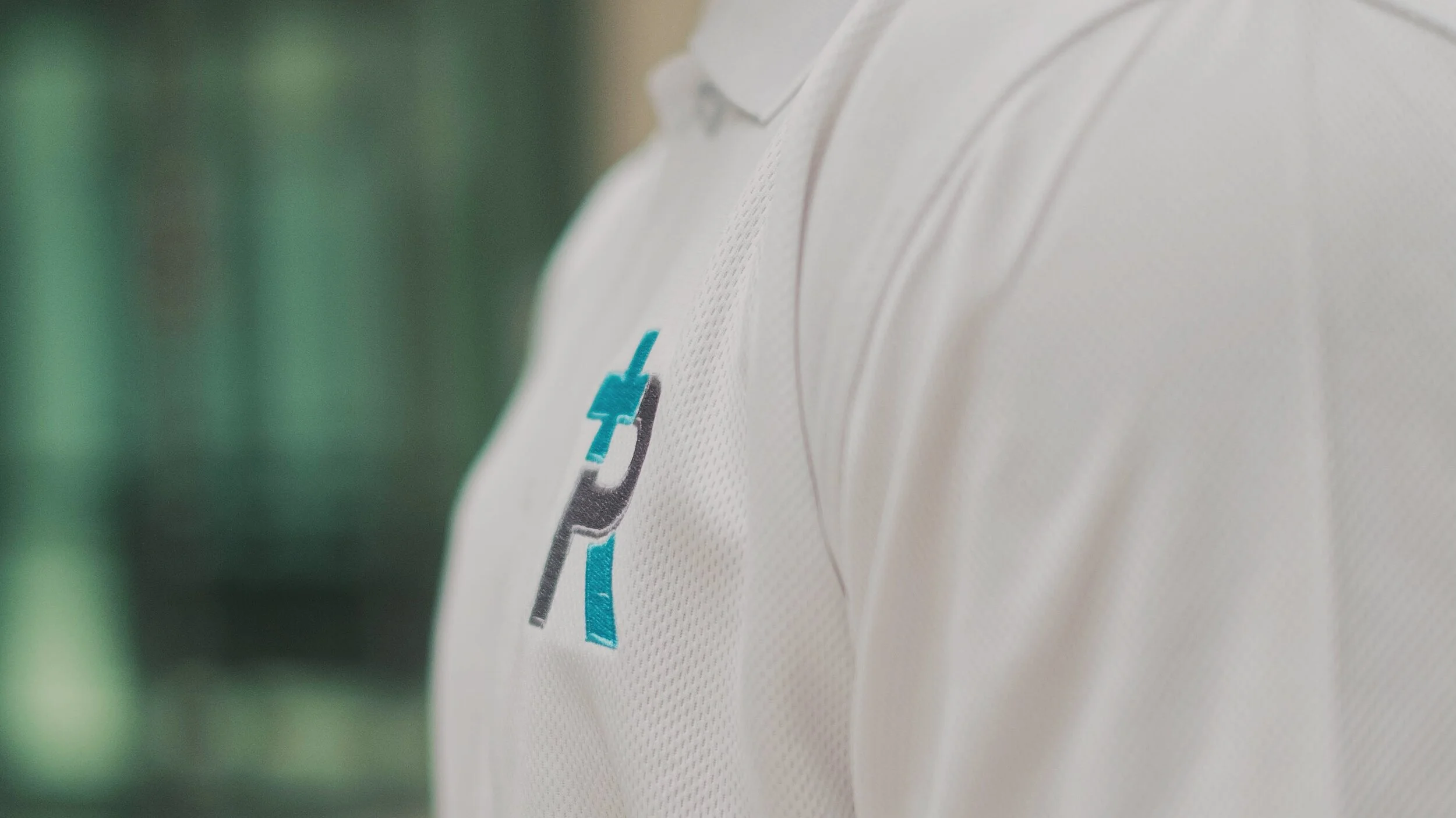
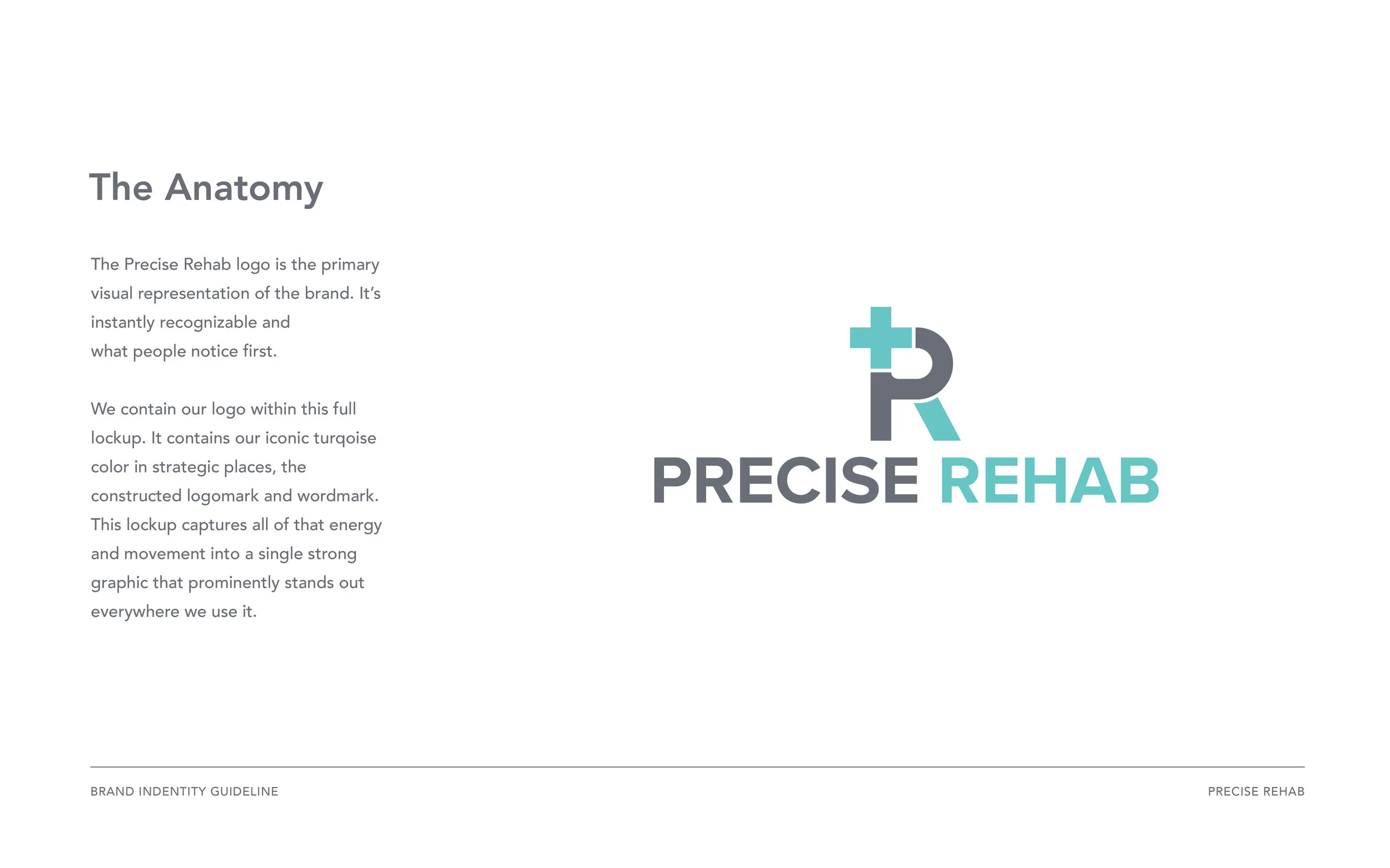
Precise Rehab organization inspires trust and confidence in their certified practices. Using clean, stenciled forms and basic shapes, the logo quickly and quietly conveys simplicity and function. We searched and replaced the old with the just-right shade of white – fresh, not sterile – and paired it with a calming turquoise.


BRAND POSITIONING
After a thorough brief on the brand's history and inner workings, we began crafting the foundation, articulating Precise Rehab's vision and values. There was mutual agreement that we elevate the organization's commitment to being the central hub for physical rehabilitation while reaffirming its expertise and life-long learner attitude.


Next, we refined the Precise Rehab's voice—given that the organization oversees two discrete arms, health care and advocacy, each with distinct aims and audiences. We had to be conscientious when it came to expressing that voice in different contexts. In addition to offering tonal guardrails for each, we established firm rules for type, colour and imagery to differentiate healthcare communications from advocacy.